UX CASE STUDY
PropertyPhotos for Realpage
A comprehensive media management platform for property management companies.
Summary
RealPage is a software company serving the multifamily, commercial, single-family, and vacation rental housing industries. PropertyPhotos was a new initiative developed to streamline how property management companies source, manage, and protect their media assets. The goal was to create a customer-facing platform where users could purchase stock and custom media, as well as manage assets at the property level using a Digital Asset Manager (DAM). This replaced a previously manual process handled through customer service and creative teams. A key feature of the platform was the integration of Digital HealthCheck™, a tool designed to help users analyze, safeguard, and proactively address potential risks related to their media assets.
My role
Lead UX/UI Designer & helped with research
The team
Lead UX/UI Designer, Product Owner, Business Analyst, 4 Engineers
Tools
Sketch, InVision, Zeplin, Adobe CC, Jira, Confluence
Timeline
1 year 10 months
Business constraints
Only 4 Engineers
Only 1 Designer
Tight Deadlines
Business requirements
01
Registration and authentication
02
eCommerce/Payments
eCommerce/Payments
03
Manage Media
Manage Media
04
Marketplace (search, find, and purchase)
05
Digital asset healthcheck (Curation)
06
Projects (create content)
Project lifecycle
01
Gather requirements
02
Synthesize existing research
03
Design and development phase
04
Beta launch
05
Test
06
Iterate & Launch
Research
I Conducted an in-depth analysis of competitor platforms to identify opportunities and best practices and collaborated with the research team on crafting user personas. To inform our approach, I spoke with marketing teams and property professionals about the tools and websites they relied on, as well as their current process for acquiring custom media. These conversations provided valuable insight into user needs and gaps in the existing experience.
Competitive analysis
I conducted a competitive analysis to comprehend the strengths, weaknesses, similarities, and distinctions among competitor digital asset management sites, as well as stock photography and stock footage platforms. Additionally, I examined how these platforms addressed specific user flows.
Research goals
Our objective was to explore how property professionals handle the management and procurement of their digital media assets, identifying the key challenges and pain points associated with the tools and web applications they use.
Interviews
From moderated user interviews we were able to learn about property professional’s goals, frustrations, motivations, and attitudes.
Key insights from the interviews included:
Property professionals relied on Shutterstock and Adobe Stock for general and community images but faced challenges in finding assets for specific purposes.
Some professionals resorted to utilizing in-house resources to create the assets they required.
A common frustration emerged from the necessity to navigate multiple avenues for acquiring media, leading to a desire to streamline and spend less time on the process.
The consensus among professionals was the need for a centralized platform to manage all their assets efficiently and facilitate easy sharing of media.
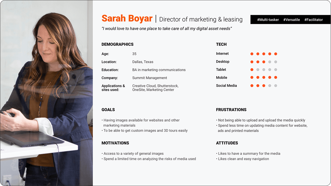
Persona development
From the interviews, I compiled and constructed personas. This process involved distilling the collected information and insights from the interviews into fictional but representative characters that embody the key traits, behaviors, and needs identified during the interview process. These personas served as archetypal representations of the target audience, providing a valuable reference for design decisions and ensuring a user-centered approach in the development of PropertyPhotos.
The solution - manage, protect, create, and explore
I conducted a competitive analysis to comprehend the strengths, weaknesses, similarities, and distinctions among competitor digital asset management sites, as well as stock photography and stock footage platforms. Additionally, I examined how these platforms addressed specific user flows.
Brainstorming solutions
Exploring different design concepts
Upon understanding the users' priorities, we recognized that the primary offerings, in order of significance, were manage, protect, create, and explore. We adopted this terminology to ensure users comprehended the site's core functionalities.
Site maps
Below are the initial site maps provided by the product team. These underwent substantial changes during the site's development.
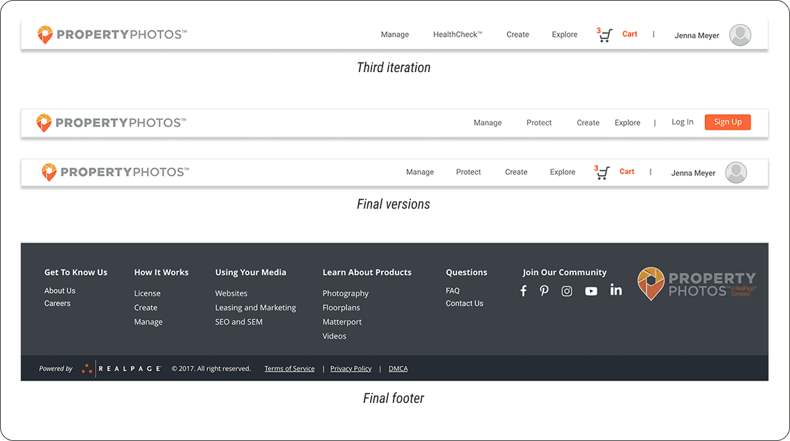
Navigation
The navigation went through several iterations. The problem we found through research was that the word "HealthCheck" did not make sense to most people so we renamed it "Protect". I also changed "License" to "Explore".
Sketches and whiteboarding
Throughout the project, the product team and I collaborated closely in whiteboarding sessions to brainstorm ideas and work through design challenges together. We shared quick sketches to explore different directions and make sure every part of the site was carefully considered. This hands-on, iterative process helped us refine our thinking, align on solutions, and build a strong foundation for the site’s overall design and functionality.
Wireframes
I started by creating wireframes for every key page, carefully mapping out user flows and exploring multiple design solutions to address usability and business goals. Throughout the process, I iterated on concepts and presented my work in regular review sessions with the Product team, gathering feedback and refining the designs to align with both user needs and technical constraints.
Sketches amd whiteboarding
Throughout the project, the product team and I collaborated closely in whiteboarding sessions to brainstorm ideas and work through design challenges together. We shared quick sketches to explore different directions and make sure every part of the site was carefully considered. This hands-on, iterative process helped us refine our thinking, align on solutions, and build a strong foundation for the site’s overall design and functionality.
Wireframes
I started by creating wireframes for every key page, carefully mapping out user flows and exploring multiple design solutions to address usability and business goals. Throughout the process, I iterated on concepts and presented my work in regular review sessions with the Product team, gathering feedback and refining the designs to align with both user needs and technical constraints.
Navigation
The navigation went through several iterations. The problem we found through research was that the word "HealthCheck" did not make sense to most people so we renamed it "Protect". I also changed "License" to "Explore".
Sketches and whiteboarding
Throughout the project, the product team and I collaborated closely in whiteboarding sessions to brainstorm ideas and work through design challenges together. We shared quick sketches to explore different directions and make sure every part of the site was carefully considered. This hands-on, iterative process helped us refine our thinking, align on solutions, and build a strong foundation for the site’s overall design and functionality.
Wireframes
I started by creating wireframes for every key page, carefully mapping out user flows and exploring multiple design solutions to address usability and business goals. Throughout the process, I iterated on concepts and presented my work in regular review sessions with the Product team, gathering feedback and refining the designs to align with both user needs and technical constraints.


Outcomes
I stayed closely involved in the development of the federated search feature, reviewing progress and ensuring the implementation matched the design specifications. One of Trimble’s subsidiary companies reviewed our work and responded with strong, positive feedback on the improvements we introduced.
As for the concept car project, we were just about to hand off our work to the team responsible for producing the final video when an unexpected round of layoffs impacted our entire team, bringing the project to an abrupt end.
Research
I Conducted an in-depth analysis of competitor platforms to identify opportunities and best practices and collaborated with the research team on crafting user personas. To inform our approach, I spoke with marketing teams and property professionals about the tools and websites they relied on, as well as their current process for acquiring custom media. These conversations provided valuable insight into user needs and gaps in the existing experience.
Competitive analysis
I conducted a competitive analysis to comprehend the strengths, weaknesses, similarities, and distinctions among competitor digital asset management sites, as well as stock photography and stock footage platforms. Additionally, I examined how these platforms addressed specific user flows.
Research goals
Our objective was to explore how property professionals handle the management and procurement of their digital media assets, identifying the key challenges and pain points associated with the tools and web applications they use.
Interviews
From moderated user interviews we were able to learn about property professional’s goals, frustrations, motivations, and attitudes.
Key insights from the interviews included:
Property professionals relied on Shutterstock and Adobe Stock for general and community images but faced challenges in finding assets for specific purposes.
Some professionals resorted to utilizing in-house resources to create the assets they required.
A common frustration emerged from the necessity to navigate multiple avenues for acquiring media, leading to a desire to streamline and spend less time on the process.
The consensus among professionals was the need for a centralized platform to manage all their assets efficiently and facilitate easy sharing of media.
Persona development
From the interviews, I compiled and constructed personas. This process involved distilling the collected information and insights from the interviews into fictional but representative characters that embody the key traits, behaviors, and needs identified during the interview process. These personas served as archetypal representations of the target audience, providing a valuable reference for design decisions and ensuring a user-centered approach in the development of PropertyPhotos.
The solution - manage, protect, create, and explore
I conducted a competitive analysis to comprehend the strengths, weaknesses, similarities, and distinctions among competitor digital asset management sites, as well as stock photography and stock footage platforms. Additionally, I examined how these platforms addressed specific user flows.
Brainstorming solutions
Site maps
Below are the initial site maps provided by the product team. These underwent substantial changes during the site's development.
Navigation
The navigation went through several iterations. The problem we found through research was that the word "HealthCheck" did not make sense to most people so we renamed it "Protect". I also changed "License" to "Explore".
Hi fidelity design
The original concept for the site was heavily focused on searching for and purchasing content—think of it as a Shutterstock-style platform tailored for property management companies. Over time, the focus shifted toward media management, evolving into more of a digital asset manager. Users could still purchase existing media or place custom orders, but the management tools became a core feature. I explored several iterations during this shift, starting with a homepage that included a prominent search bar, which was eventually removed in later versions to support the new direction.
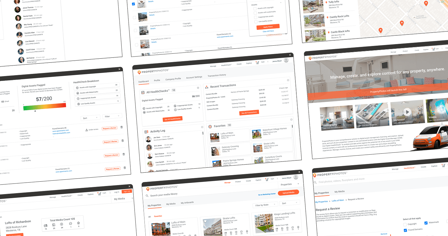
Homepage
The homepage went through several iterations. Initially, it featured a search bar in the hero image, but that was removed once the focus shifted more toward media management.
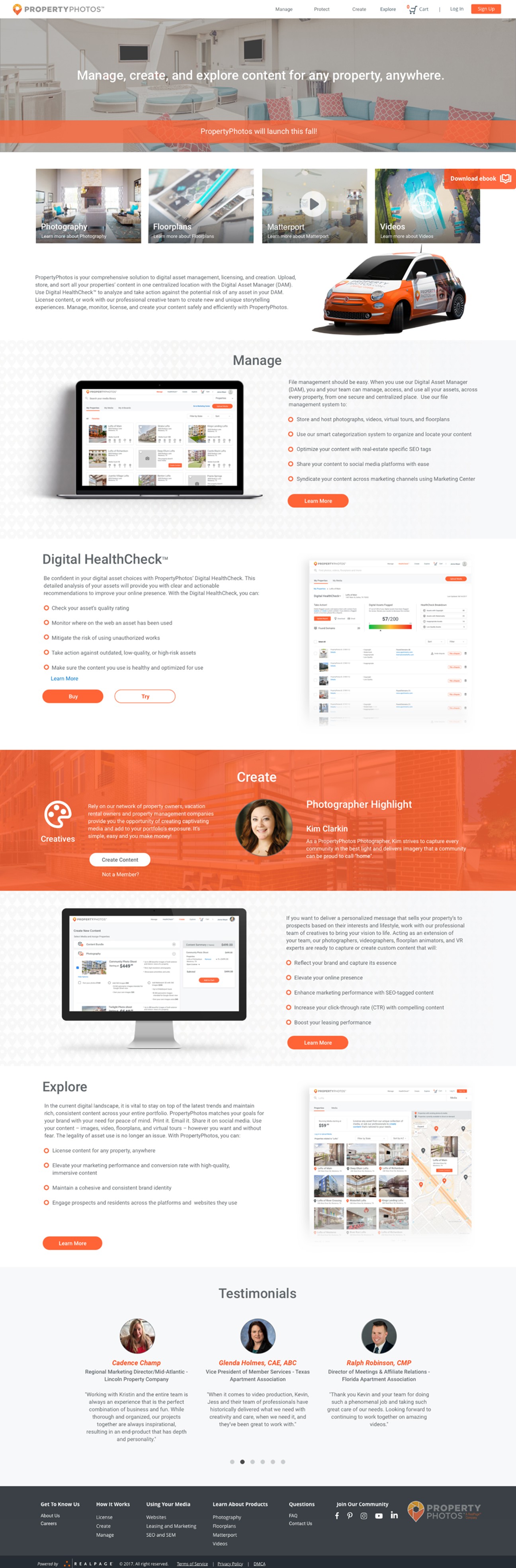
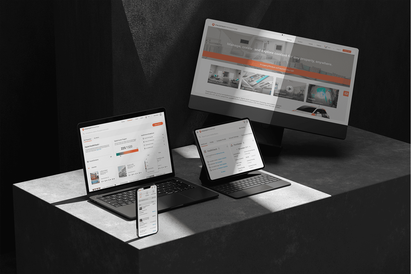
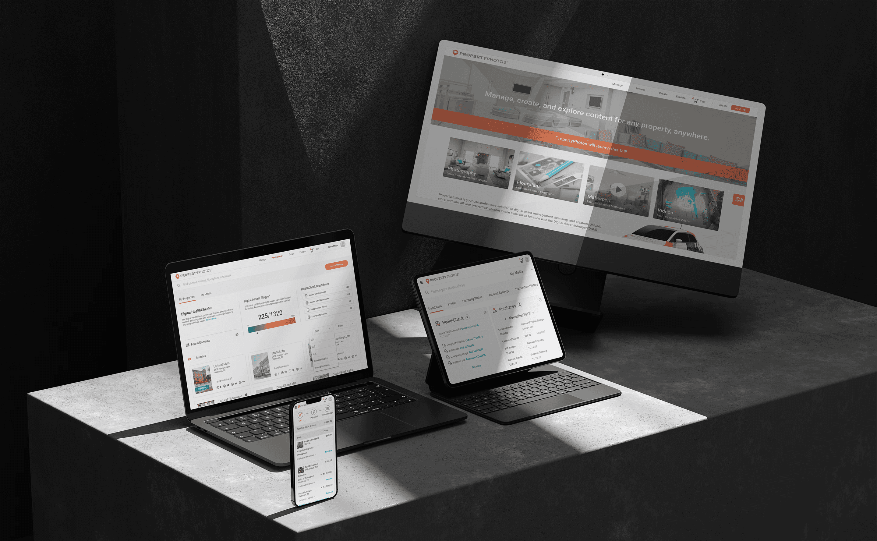
Homepage (final design)
Homepage (final design)
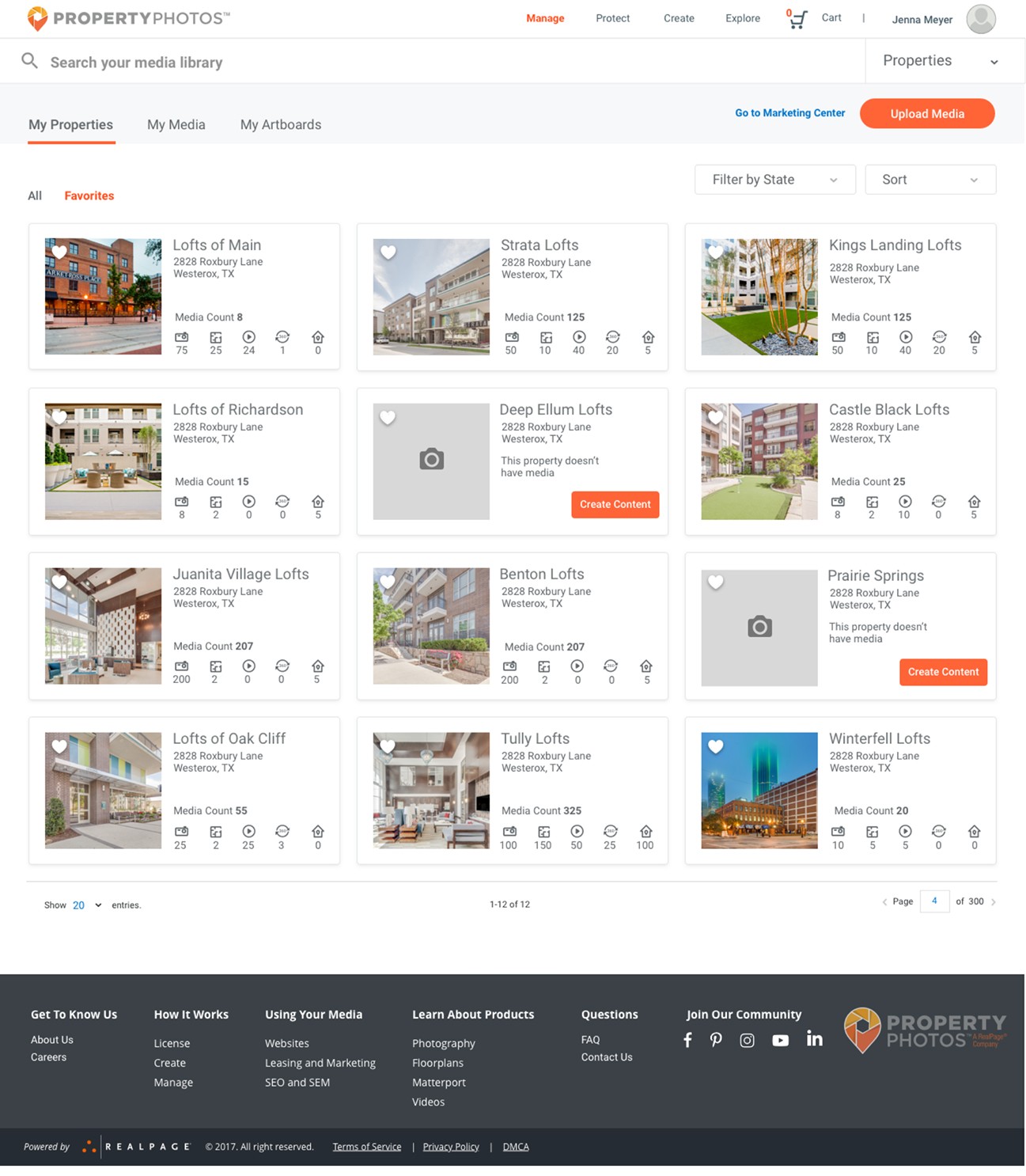
Mange media
This section of the site is where users can manage their assets—everything from creating collections and uploading custom content to managing property-specific subscriptions and building artboards (media collections that can be shared or added to the cart).
I started with an initial sketch that featured a left-side navigation, but ultimately shifted to a cleaner, more visual layout that gave priority to the media. The final design uses top-level tabs and filters for simple navigation, with dedicated views for properties, a complete media library, and artboards. The dashboard-style layout offers a high-level overview of all properties, and users can click into each one for a detailed breakdown, including all associated media and the number of assets by type.
Homepage (final design)
Homepage (final design)
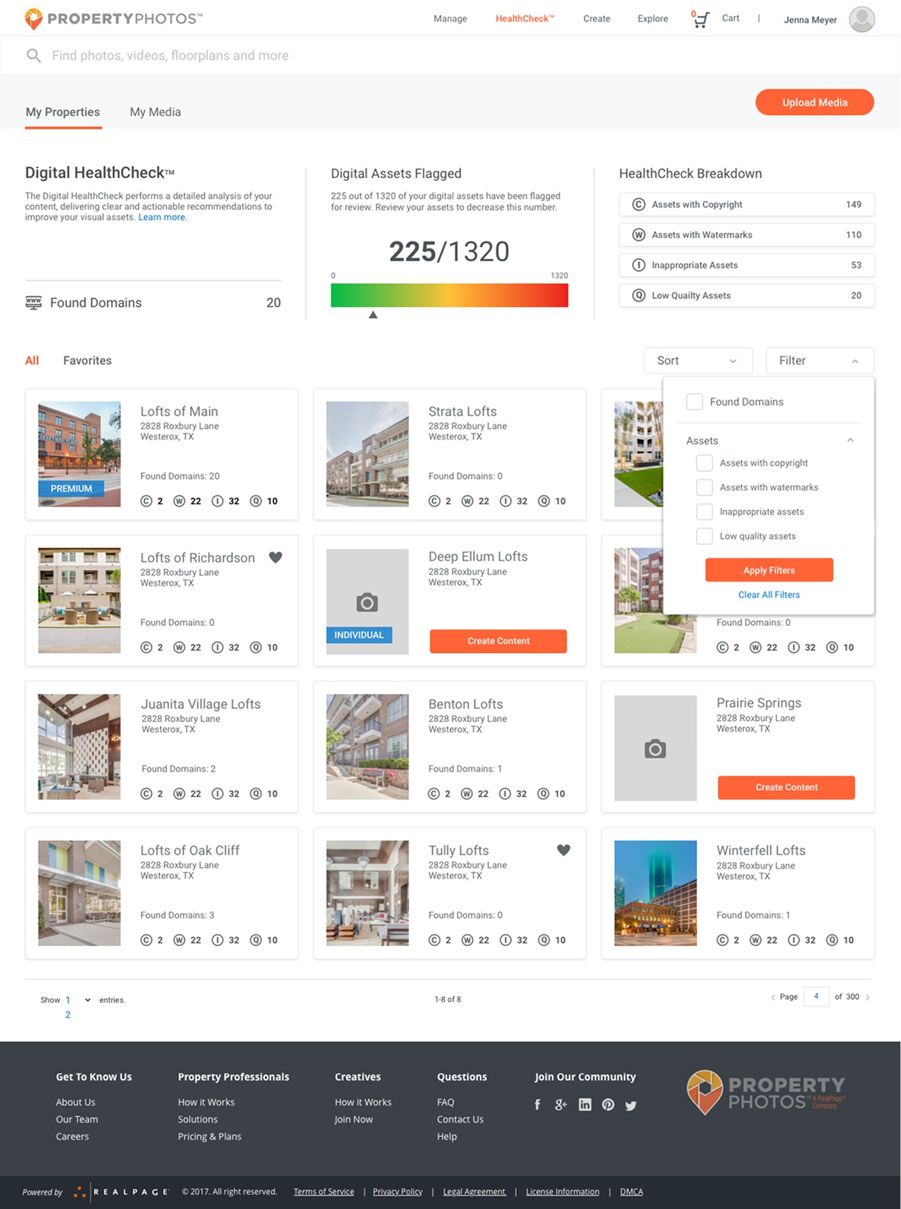
Protect (Healthcheck)
The Safeguard section of the site enables users to run health checks on individual properties or their entire media library. Tabs allow users to switch between property-level and media-level reports, making it easy to zoom in on specific issues or get a comprehensive view of asset health.
To maintain a cohesive user experience, I mirrored the structure and layout of the Manage Media section.
Refinements included streamlining the top of the page, updating icons for better clarity and switching them to a neutral grey, introducing a central graph to display the percentage of flagged digital assets, and redesigning the data breakdown into an easy-to-scan card layout positioned at the top right.
Manage media dashboard
Protect (Healthcheck)
The Safeguard section of the site enables users to run health checks on individual properties or their entire media library. Tabs allow users to switch between property-level and media-level reports, making it easy to zoom in on specific issues or get a comprehensive view of asset health.
To maintain a cohesive user experience, I mirrored the structure and layout of the Manage Media section.
Refinements included streamlining the top of the page, updating icons for better clarity and switching them to a neutral grey, introducing a central graph to display the percentage of flagged digital assets, and redesigning the data breakdown into an easy-to-scan card layout positioned at the top right.
HealthCheck
HealthCheck
HealthCheck
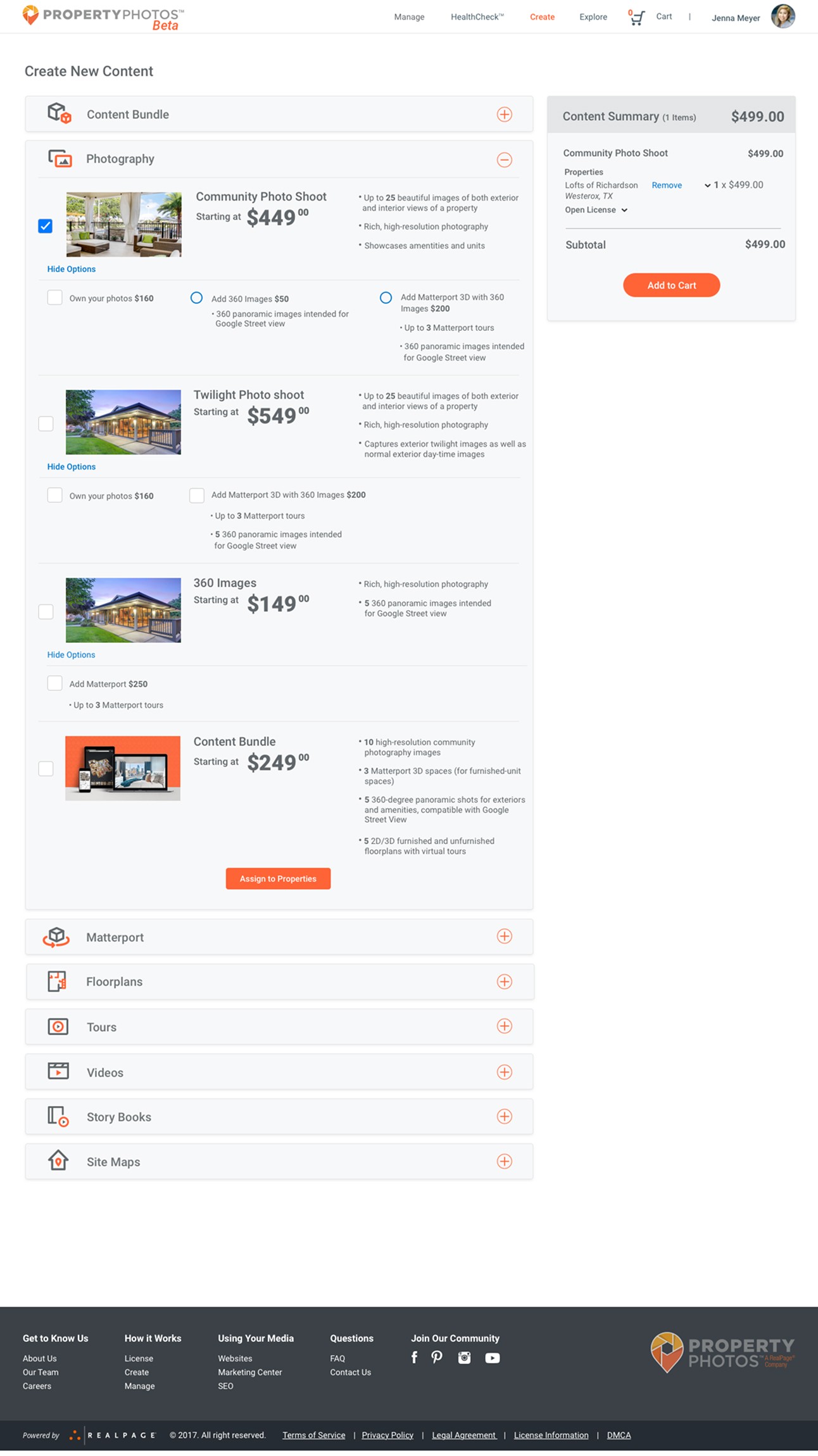
Create media
I initially used top tabs to navigate media categories, but as the content types grew, that approach quickly became limiting. To improve scalability and usability, I switched to an accordion-style layout, which provided a cleaner structure and greater flexibility. The final design reflects this evolution, resulting in a more streamlined and intuitive user experience.
Create new content
Explore media
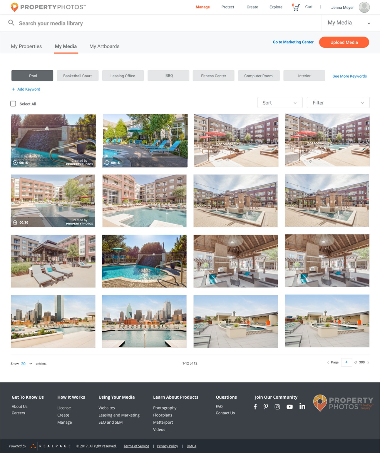
This is the Explore section of the site, designed to help users discover and purchase media they don’t yet own but is available through RealPage. To maintain a seamless experience, the layout mirrors the structure of other areas on the platform.
In the Property View, users can browse media by property, view locations on a map, and click into individual listings for more detail. The Search by Media tab allows for keyword and filter-based searches across the entire media library.
This layout proved effective and remained largely unchanged from beta through launch, requiring only minor refinements.
Search media
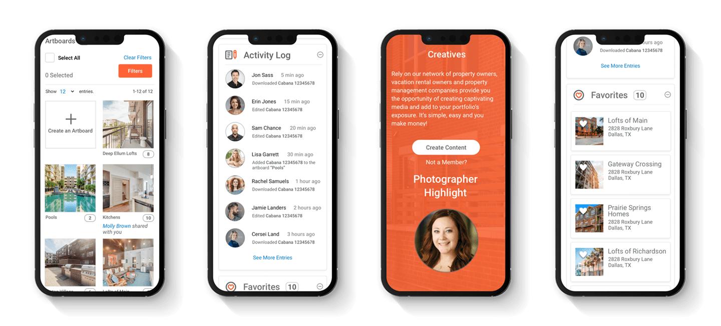
Mobile
All user flows were designed to ensure responsiveness across various device types.
Mobile
All user flows were designed to ensure responsiveness across various device types.
Launch and Testing
After the beta launch, we began testing with property marketing managers and content creators, both in-person and remotely. The goal was to understand how users interacted with various content layouts and filter options across different workflows. Using unmoderated testing through UserZoom, we gathered insights into user preferences and behaviors.
The feedback was instrumental in refining key areas of the site, especially the manage media, search, and checkout flows. The manage media feature stood out as a user favorite, prompting a strategic shift away from emphasizing media sales toward a stronger focus on asset management. As a result, the search bar was removed from the masthead. I also began developing a more advanced upload process in response to feedback from content creators dealing with large batches of media.
Users consistently praised the site’s clean design and intuitive navigation. Based on feedback from beta testing, we enhanced the create content feature and introduced new components like user profiles and dashboards. After multiple iterations, the site officially launched.
Additional User Flows
(Not Included)
• Checkout
• Profile
• Marketing pages
• Upload Media
• Account/ login experience
• Website templates
• Artboards (Media collections)
• Plans and Pricing
• Create Content Project Dashboard
The Future of PropertyPhotos and Project Outcome
Many features—like the step-by-step custom media ordering process—were still in development or early design stages during my time on the project. PropertyPhotos remained in a continuous state of evolution as we refined the platform.
Before my departure, the site successfully launched and attracted hundreds of property management companies as clients.
Learn how Campus Advantage relies on PropertyPhotos to elevate its brand in a video on the Realpage site. Click the “See video” button below and scroll down the page. Click the “Visit site” button to see the PropertyPhotos web site.
Additional User Flows (Not Included)
• Checkout
• Profile
• Marketing pages
• Upload Media
• Account/ login experience
• Website templates
• Artboards (Media collections)
• Plans and Pricing
• Create Content Project Dashboard
The Future of PropertyPhotos and Project Outcome
Many features—like the step-by-step custom media ordering process—were still in development or early design stages during my time on the project. PropertyPhotos remained in a continuous state of evolution as we refined the platform.
Before my departure, the site successfully launched and attracted hundreds of property management companies as clients.
Learn how Campus Advantage relies on PropertyPhotos to elevate its brand in a video on the Realpage site. Click the “See video” button below and scroll down the page. Click the “Visit site” button to see the PropertyPhotos web site.
11
11# of property rental companies that signed up for the beta version
275
# of new PropertyPhotos.com accounts right after launch
Search media
Create new content
Hi fidelity design
The original concept for the site was heavily focused on searching for and purchasing content—think of it as a Shutterstock-style platform tailored for property management companies. Over time, the focus shifted toward media management, evolving into more of a digital asset manager. Users could still purchase existing media or place custom orders, but the management tools became a core feature. I explored several iterations during this shift, starting with a homepage that included a prominent search bar, which was eventually removed in later versions to support the new direction.
Homepage
The homepage went through several iterations. Initially, it featured a search bar in the hero image, but that was removed once the focus shifted more toward media management.
Mange media
This section of the site is where users can manage their assets—everything from creating collections and uploading custom content to managing property-specific subscriptions and building artboards (media collections that can be shared or added to the cart).
I started with an initial sketch that featured a left-side navigation, but ultimately shifted to a cleaner, more visual layout that gave priority to the media. The final design uses top-level tabs and filters for simple navigation, with dedicated views for properties, a complete media library, and artboards. The dashboard-style layout offers a high-level overview of all properties, and users can click into each one for a detailed breakdown, including all associated media and the number of assets by type.
Homepage (final design)
Create media
I initially used top tabs to navigate media categories, but as the content types grew, that approach quickly became limiting. To improve scalability and usability, I switched to an accordion-style layout, which provided a cleaner structure and greater flexibility. The final design reflects this evolution, resulting in a more streamlined and intuitive user experience.
Mobile
All user flows were designed to ensure responsiveness across various device types.
Homepage (final design)
Homepage (final design)
Manage media dashboard
HealthCheck
Create new content
Search media
Create new content
Search media
Exploring different design concepts
Upon understanding the users' priorities, we recognized that the primary offerings, in order of significance, were manage, protect, create, and explore. We adopted this terminology to ensure users comprehended the site's core functionalities.
Sketches and whiteboarding
Throughout the project, the product team and I collaborated closely in whiteboarding sessions to brainstorm ideas and work through design challenges together. We shared quick sketches to explore different directions and make sure every part of the site was carefully considered. This hands-on, iterative process helped us refine our thinking, align on solutions, and build a strong foundation for the site’s overall design and functionality.
Wireframes
I started by creating wireframes for every key page, carefully mapping out user flows and exploring multiple design solutions to address usability and business goals. Throughout the process, I iterated on concepts and presented my work in regular review sessions with the Product team, gathering feedback and refining the designs to align with both user needs and technical constraints.

Hi fidelity design
The original concept for the site was heavily focused on searching for and purchasing content—think of it as a Shutterstock-style platform tailored for property management companies. Over time, the focus shifted toward media management, evolving into more of a digital asset manager. Users could still purchase existing media or place custom orders, but the management tools became a core feature. I explored several iterations during this shift, starting with a homepage that included a prominent search bar, which was eventually removed in later versions to support the new direction.
Homepage
The homepage went through several iterations. Initially, it featured a search bar in the hero image, but that was removed once the focus shifted more toward media management.
Homepage (final design)
Homepage (final design)
Mange media
This section of the site is where users can manage their assets—everything from creating collections and uploading custom content to managing property-specific subscriptions and building artboards (media collections that can be shared or added to the cart).
I started with an initial sketch that featured a left-side navigation, but ultimately shifted to a cleaner, more visual layout that gave priority to the media. The final design uses top-level tabs and filters for simple navigation, with dedicated views for properties, a complete media library, and artboards. The dashboard-style layout offers a high-level overview of all properties, and users can click into each one for a detailed breakdown, including all associated media and the number of assets by type.
Protect (Healthcheck)
The Safeguard section of the site enables users to run health checks on individual properties or their entire media library. Tabs allow users to switch between property-level and media-level reports, making it easy to zoom in on specific issues or get a comprehensive view of asset health.
To maintain a cohesive user experience, I mirrored the structure and layout of the Manage Media section.
Refinements included streamlining the top of the page, updating icons for better clarity and switching them to a neutral grey, introducing a central graph to display the percentage of flagged digital assets, and redesigning the data breakdown into an easy-to-scan card layout positioned at the top right.
HealthCheck
Manage media dashboard
Create media
I initially used top tabs to navigate media categories, but as the content types grew, that approach quickly became limiting. To improve scalability and usability, I switched to an accordion-style layout, which provided a cleaner structure and greater flexibility. The final design reflects this evolution, resulting in a more streamlined and intuitive user experience.
Explore media
This is the Explore section of the site, designed to help users discover and purchase media they don’t yet own but is available through RealPage. To maintain a seamless experience, the layout mirrors the structure of other areas on the platform.
In the Property View, users can browse media by property, view locations on a map, and click into individual listings for more detail. The Search by Media tab allows for keyword and filter-based searches across the entire media library.
This layout proved effective and remained largely unchanged from beta through launch, requiring only minor refinements.
Search media
Mobile
All user flows were designed to ensure responsiveness across various device types.
Launch and Testing
After the beta launch, we began testing with property marketing managers and content creators, both in-person and remotely. The goal was to understand how users interacted with various content layouts and filter options across different workflows. Using unmoderated testing through UserZoom, we gathered insights into user preferences and behaviors.
The feedback was instrumental in refining key areas of the site, especially the manage media, search, and checkout flows. The manage media feature stood out as a user favorite, prompting a strategic shift away from emphasizing media sales toward a stronger focus on asset management. As a result, the search bar was removed from the masthead. I also began developing a more advanced upload process in response to feedback from content creators dealing with large batches of media.
Users consistently praised the site’s clean design and intuitive navigation. Based on feedback from beta testing, we enhanced the create content feature and introduced new components like user profiles and dashboards. After multiple iterations, the site officially launched.
Additional User Flows (Not Included)
• Checkout
• Profile
• Marketing pages
• Upload Media
• Account/ login experience
• Website templates
• Artboards (Media collections)
• Plans and Pricing
• Create Content Project Dashboard
The Future of PropertyPhotos and Project Outcome
Many features—like the step-by-step custom media ordering process—were still in development or early design stages during my time on the project. PropertyPhotos remained in a continuous state of evolution as we refined the platform.
Before my departure, the site successfully launched and attracted hundreds of property management companies as clients.
Learn how Campus Advantage relies on PropertyPhotos to elevate its brand in a video on the Realpage site. Click the “See video” button below and scroll down the page. Click the “Visit site” button to see the PropertyPhotos web site.
11
11# of property rental companies that signed up for the beta version
275
# of new PropertyPhotos.com accounts right after launch
Create new content